Early in these years, when the fans were fewer and the shows less frequent, advertising posters often were tacked to laundromat and convenience store bulletin boards, or taped to streetlight poles or boarded walls blocking construction sites. As the scene grew, the original posting locations became so overcrowded that the facades of buildings, the backs of traffic signs, unguarded windows, trash cans, phone booths, and even sidewalk surfaces played host to unrelenting plastering in the name of free publicity. In Boston, college campuses, with their young and curious populations, were prime targets. What resulted from the onslaught of promo, besides a burst of attendance that allowed the music to flourish, was a number of spectacular cooperative murals (for want of a better word) that gradually evolved into wondrous palimpsests of flyers, old and new: old ones torn away or partially obliterated by others for later shows, themselves already ravaged once their moment had passed; the random visual punctuation of brightly colored corners of staple-mounted flyers still clinging after their out-dated announcements had been ripped away;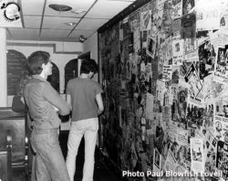 the glistening insistence of posters that clung to their territory long after their normal life expectancy, due to their having been affixed by a complete cover of cellophane tape or, better, glue. It was a sight to see, as visually arresting in its own way as the graffiti that during that same period adorned the exteriors of the New York subway system, celebrated in Norman Mailer’s The Faith of Graffiti.
Like the subway graffiti, these were displays visitors might admire, or deplore. For Boston residents, they often went barely noticed—again, much like graffiti, just another part of the urban landscape, and one that gradually re-shaped the city dwellers’ perception of their environment. It’s hard to walk daily by an explosion of slogans, shapes and colors without wondering what the hoopla is about.
For those actually posting them—band members, or their enlisted friends and fans—they were more vital. Street posters were perhaps the most crucially persuasive means of drawing an audience. The bars hosting this music—The Rat, Cantone’s, The Club, The Space, The Paradise, the 1270, Mavericks—even, to some extent, the venerable Inn Square Men’s Bar; and a little later, the Middle East, TT the  Bear’s, Underground, Streets, Johnny D’s, Chet’s Last Call and the re-vamped Bunratty’s—ran ads in The Phoenix and The Real Paper that did little more than list the lineups for each night of the week, occasionally inserting a photo of a well-known headliner.
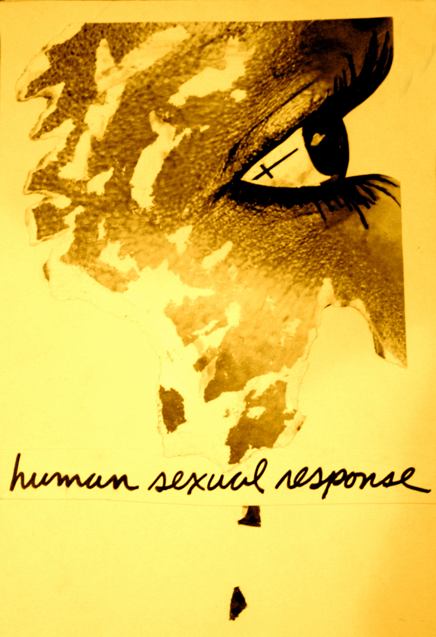
The posters, on the other hand, gave you a taste of a band’s personality. The imagery and phrasing of the announcement (e.g. “Three Loveable Bands”, i.e. Human Sexual Response, The Girls and The Rentals) gave you a sense of the band’s identity, and often its sound. Who among us hasn’t been lured to a show solely by virtue of a provocative ad?
Posters for gigs at institutions of higher learning, such as Boston University, the Boston Architectural Center, Massachusetts College of Art, the Boston Film and Video Foundation, and the Museum School, were generally more expressive than the newspaper ads, but never seemed to equal the enthusiastic display of the band-generated posters. (The major thrust radio stations like WBCN, WTBS (later WMBR), WFNX and WERX provided for the music of this time must be acknowledged, but their contribution is another story.)
A protocol naturally emerged regarding physical poster posting. When the scene was still in its infancy, it was usually easy to find an available wall or doorway. By the early 1980s, however, those same spots were often so fully blanketed that one had to choose which rival band’s flyer to cover with one’s own. Ideally, one chose an ad for a show that had already occurred, but often enough one had to decide whether to resist the temptation to post over a show booked for the same date as one own’s upcoming gig, or move on hopefully to the next block.
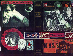
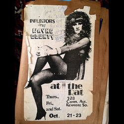
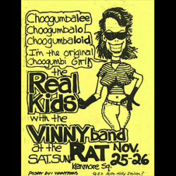
What made these posters so persuasive was that they looked the way the music sounded. The earliest—for The Infliktors, The Real Kids, Ready Teddy, Thundertrain, among others—were often barely more than block-lettered dates and addresses below the band’s name, reflecting not only the bands’ straight-ahead rock sound, but also the relatively primitive inexpensive photo-reproduction techniques of the time. Pre-dating even these groundbreaking groups was Willie Alexander, whose career spans this entire era (and beyond), and whose flyers over the years employed a variety of visual styles, from bluntly informational announcements, through early experimentation with black and white Xerox portraits, and later into some evocative collage experiments. Consistently, though, his flyers displayed the dizzy exuberance that characterized his onstage presence.
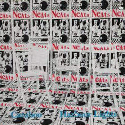
Within only a couple of years commercial copy shops made great strides, enabling the newer tide of musicians to promote themselves with more finesse. Lower costs made possible serial postings: a strip of six, eight, ten or more of the same poster briskly stapled along the length of a wall, as speedily as someone from another band painstakingly mounted a single flyer with masking tape at the far end of the same expanse, made a strikingly different impression. The effect was beautifully employed on the cover of The Neats’ “Caraboo” 45, one of the many independently released records whose artwork echoed street posters.
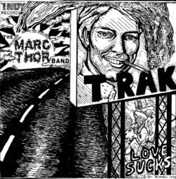

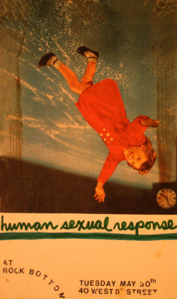
The popularization of the color Xerox was a game-changer. It didn’t offer just new visual options; it signaled the opportunity of a more expressive and personal form of self-promotion. The expanded palette inspired vision in more ways than color only. Collage and photo-appropriation of images, while not new in themselves, ran rampant during this period, perhaps due to the punk penchant of pasting together a look from scraps of the larger culture.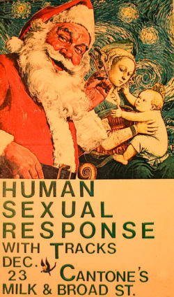 Just as the kids in clubs were piecing outfits together with safety pins, the posters for the shows they attended were assembled with scotch tape and fixed to walls with staples. And just as a Fiorucci tee shirt might be defaced by an obscene screen-print, so a Van Gogh skyscape might find itself the backdrop of an ad for a gig at Cantone’s.
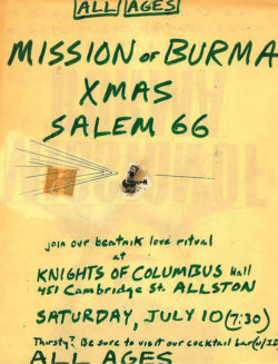
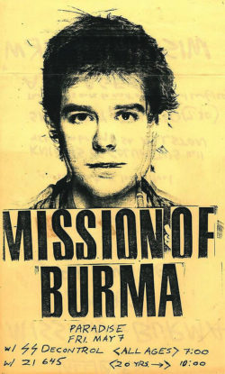
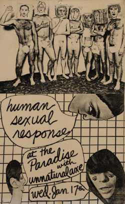
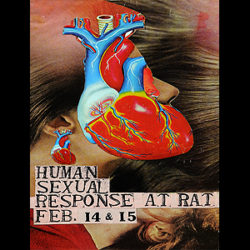
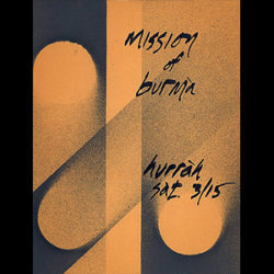
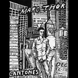
The range of visual styles that emerged during this period is impressive. La Peste posters often featured a single striking, often sexily streamlined, image, with lettering frequently as elegant as the band’s signature logo, but other times ironically crude. Human Sexual Response favored a crazy-quilt, collaged approach that achieved an absurdist sophistication. Mission of Burma alternated between the extreme austerity (to the edge of illegibility) of the earlier era’s minimal announcements, and the technological mind-fuck of the poster featuring the superimposed faces of all four band-members, resembling all and none of them simultaneously. The Girls posed for one ad in an innocuous living room setting, the least likely place one might comfortably encounter them. Marc Thor and The Vinny Band took comic-book art into radically divergent realms of the romantic/sublime and the Zap underground.
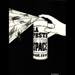
Authorship was generally vague. Although a large number of posters remained, even in the heyday of the era, perfunctory, no-frills announcements, the majority were created, if not as actual art works, at least as aesthetic provocations. Extremely few, however, were ever signed. Notable exceptions are Ann Prim’s posters for The Ann Prim Group and, later, The November Group; Siri Howard’s brilliantly clever aerosol poster for La Peste;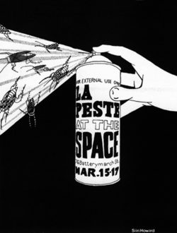 Ralph Fatello’s “Vinnytoon signature for The Vinny Band’s posters; and Pat McDowell’s occasional credits for her brooding portraits of Marc Thor in various catastrophic environments, which were ultimately gathered together as a coloring book. Dini Lamot sometimes signed his artwork for Human Sexual Response with a lipstick kiss.
Noteworthy also is the relative absence of portraits of the bands themselves in their ads. It may be an indication of the period’s mindset that incongruous, surreal, and dadaesque images predominate. When one does encounter the musicians, it is usually with calculated effect, such as the aforementioned superimposed Mission of Burma group portrait, or Human Sexual Response’s nude pose with clunky self-portraits drawn on the bags over their heads.
Much of this artwork was unabashedly illegal. The bands stole licks, postures, and often lyrics from those who had gone before, but rarely to the point of prosecution. It’s perhaps then not surprising that the posters advertising these bands were never, or rarely, prosecuted for similar infringements. Many repeatedly used images appropriated from copyrighted artwork, sometimes defensively transmuted, other times not.
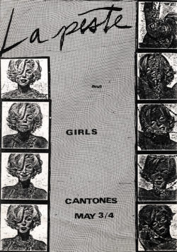 La Peste’s flyer for a show with The Girls, for instance, brazenly featured contact sheet strips of Bert Stern’s photos of Marilyn Monroe; another included a Helmut Newton nude. One of Mark Dagley’s flyers for a Girls gig advertised it with a photo of The Cars. Besides the content of the posters, their actual reproduction and distribution was often similarly illegitimate. Although black and white copying was relatively affordable, color copies, newly available and seductively eye-catching with their richly saturated hues, remained pricey and outside the range of most bands’ promotional budgets. They were, however, frequently reproduced free of charge by band members or their friends who worked in copy shops without the management’s knowledge. The impact in the late 1970s of a color Xerox print plastered to the back of a stop sign at a major intersection was comparable to…well, it’s hard to think of something one could compare it to now in terms of brilliance and sidewalk seduction appeal.
The actual posting of flyers was legally problematic. Although there were, and no doubt still are, statutes on the books restricting municipal posting of ads, they were erratically enforced. Stenciled prohibitions on buildings’ walls were regularly papered over with flyers—half defiantly, half defensively—since once the stenciled ban was obliterated—particularly by multiple layers—one could plead ignorance of any infraction. 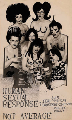 Posters were frequently torn down, often as quickly as they were affixed, but such action seemed less a form of law enforcement than the retaliation of irate residents who felt their neighborhoods were being defaced. (My own band, Human Sexual Response, had a personal anti-groupie, caught more than once in the act, who systematically removed any of our posters he could.)
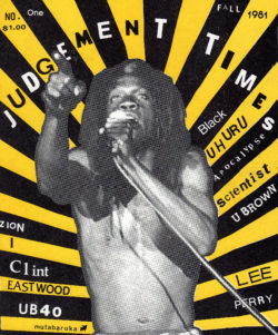
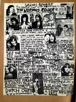
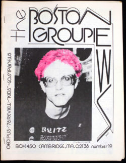
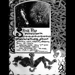
Any consideration of the range of visual styles spilling into one another during this period would be incomplete without acknowledging its cross pollination with the artwork exploding in the Boston fanzines of the time. Since they featured multiple pages (although some consisted of a single sheet), with extended reviews, interviews, photo tributes and artwork that frequently covered an entire page, the fanzines worked differently than posters; and an extended appreciation of their origins, their impact, and the people who created them is beyond the range of this discussion. Mention must be made, though, of the visual, and also social, influence of ‘zines like Killer Children, Skunk Piss, Deetails, Love & Flames, The Nervous Reader, Dirt, Hardcore, The Noise, and The Boston Groupie News, the latter two now morphed into addictive websites. The names of their creators and contributors—Mark Flynn, Blowfish, Miss Lyn, Magnus Johnstone, T Max, Kathei Logue, Carmen Monoxide, Mark (Dirt) Morrisroe, and Count (Joe) Viglione, to name only a few—are as familiar to those of us who remember the period as the names of the bands they glorified.
Notice is due, too, to the proliferation of pin-on badges, which were the ubiquitous unisex accessories of the era. Due to their size—usually a bit more or less than an inch in diameter—their graphics were generally simpler than fanzine or poster art, and their messages more blunt. The most common motif was simply a band’s logo, but frequently the badges bore whimsical, threatening, or comic images, and sometimes political and philosophical aphorisms. 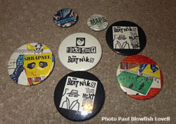 The queen of this scene was Betsy Sherman, who personally marketed her handmade wares everywhere bands played. Shirts, jackets, handbags and knapsacks, adorned and often completely covered with dozens of badges, contributed as much color to Boston sidewalks as posters did to the buildings they flanked.
I’ve written here mainly about the bands whose artifacts are on this site to refer to. There are so many more whose flyers—and music—did as much to enrich this scene: DMZ, Unnatural Axe, Lou Miami and the Kosmetix, The Neighborhoods, Moving Parts, Pastiche, Salem 66, Someone and the Somebodies, Robin Lane and the Chartbusters, The Molls, Steve Stain, Thrills, The Maps, Bound and Gagged, Boys Life, Christmas, Dangerous Birds, Luna, Third Rail, The Phantoms, and many, many more. Hopefully, some of the members of those bands will scan their old posters and send them in.
Larry Bangor
2017

Have something you want to share about this blog post,,,Thoughts on poster design and production…A related memory or story? Record a video, become a Flashpoint Contributor.[vidrack align=”right”]
 One of the chief glories of the punk/new wave scene of the late 1970s and early 1980s, arguably second only to the music, was the proliferation of a vibrant street art promoting the bands, as well as the venues where they played—“played” in both the musical and communal senses of the word. Anyone visiting one of the cities where this music exploded—New York and London, most famously, but just as conspicuously San Francisco, Los Angeles, Athens, Cleveland, Minneapolis, D.C. and, in the case at hand, Boston—couldn’t help but be struck by the erratic splotches of colored paper, frequently indecipherable images, and scribbled or recklessly printed names and locations of upcoming and past gigs that decorated the streets.
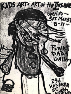
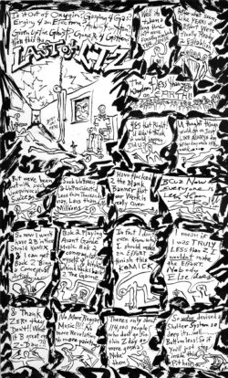
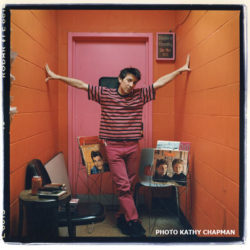 My close friend for 26 years, Magnus was one of the most prolific and under appreciated artists of his generation. Both Magnus and I were integral members of Punkt/ Data Gallery and Skunk Piss Mag where Magnus penned his art critique comic page “Less Than Zero” during the 2 1/2 years the magazine was published ( 1977 – 1980 ). The gallery and magazine were actively involved with the music scene, not only as fans but as producers of shows which included, among others: The Girls, Human Sexual Response, La Peste, DMZ… Promoting the gallery, the magazine, and the live shows meant designing and posting posters in Boston and Cambridge, and Magnus gave the same level of attention to his poster art as he did to his “art” art. As with myself, we both became DJ’s on WMBR and WZBC, and continued designing posters for many of the events both stations held over the years.

 the glistening insistence of posters that clung to their territory long after their normal life expectancy, due to their having been affixed by a complete cover of cellophane tape or, better, glue. It was a sight to see, as visually arresting in its own way as the graffiti that during that same period adorned the exteriors of the New York subway system, celebrated in Norman Mailer’s The Faith of Graffiti.
 Bear’s, Underground, Streets, Johnny D’s, Chet’s Last Call and the re-vamped Bunratty’s—ran ads in The Phoenix and The Real Paper that did little more than list the lineups for each night of the week, occasionally inserting a photo of a well-known headliner.


 Just as the kids in clubs were piecing outfits together with safety pins, the posters for the shows they attended were assembled with scotch tape and fixed to walls with staples. And just as a Fiorucci tee shirt might be defaced by an obscene screen-print, so a Van Gogh skyscape might find itself the backdrop of an ad for a gig at Cantone’s.
 Ralph Fatello’s “Vinnytoon signature for The Vinny Band’s posters; and Pat McDowell’s occasional credits for her brooding portraits of Marc Thor in various catastrophic environments, which were ultimately gathered together as a coloring book. Dini Lamot sometimes signed his artwork for Human Sexual Response with a lipstick kiss.

 La Peste’s flyer for a show with The Girls, for instance, brazenly featured contact sheet strips of Bert Stern’s photos of Marilyn Monroe; another included a Helmut Newton nude. One of Mark Dagley’s flyers for a Girls gig advertised it with a photo of The Cars. Besides the content of the posters, their actual reproduction and distribution was often similarly illegitimate. Although black and white copying was relatively affordable, color copies, newly available and seductively eye-catching with their richly saturated hues, remained pricey and outside the range of most bands’ promotional budgets. They were, however, frequently reproduced free of charge by band members or their friends who worked in copy shops without the management’s knowledge. The impact in the late 1970s of a color Xerox print plastered to the back of a stop sign at a major intersection was comparable to…well, it’s hard to think of something one could compare it to now in terms of brilliance and sidewalk seduction appeal.
 Posters were frequently torn down, often as quickly as they were affixed, but such action seemed less a form of law enforcement than the retaliation of irate residents who felt their neighborhoods were being defaced. (My own band, Human Sexual Response, had a personal anti-groupie, caught more than once in the act, who systematically removed any of our posters he could.)


 The queen of this scene was Betsy Sherman, who personally marketed her handmade wares everywhere bands played. Shirts, jackets, handbags and knapsacks, adorned and often completely covered with dozens of badges, contributed as much color to Boston sidewalks as posters did to the buildings they flanked.